


← The Wallet CVDownload PDF
Greener

Brand
guidelines.

Version 1.0 · November 2026 · Harrison Greener

Contents

What's
inside.

01The brand
06Logo on backgrounds
02Logo story
07Colour
03Logo anatomy
08Colour pairs
04Logo system
09Typography
05Clear space and sizes
Contents2 / 11

01 The brand

Design it. Build it.
Make it real.

Greener is my own brand as a designer. It's the name on everything I make, from brands and websites to apps and the odd physical object, and it should feel like one person made all of it.

Hands-onI make the thing, on screen and in real life. The brand shows the making, not just the finish.
CuriousAlways learning and trying new things. Room for experiments, never stiff.
HonestPlain words and real work. No buzzwords, no promises I can't keep.
A bit playfulA wink, not a joke. A scratchcard CV, not a clown suit.
The brand3 / 11

02 Logo story

A logo I started
at fourteen.

The Greener wordmark began when I was 14 or 15: a striped, multi-line green logo where the G flowed into the R and the letters sat on two baselines. Years later I came back to it, kept the ideas that worked, and redrew the whole thing from scratch as a clean vector.
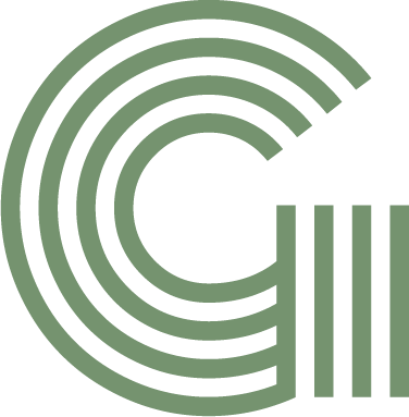
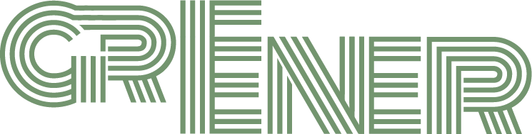
The original striped GThe original striped Greener wordmark

The originalStriped, multi-line, green. Started when I was 14.
→
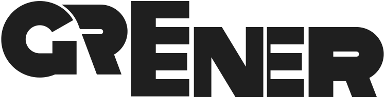
The redrawn Greener wordmark

RedrawnSolid, vector, with the details made deliberate.

Logo story4 / 11

03 Logo anatomy

The little details.

1 2 3 4
  1. The pen nib. Under the join, the little triangle of space between the G and the R's leg is shaped like the tip of a pen nib. A small nod to being a designer, if you look for it.
  2. Stacked Es. GREENER has two Es together. They stack into one tall E, which saves space and gives the wordmark its rhythm.
  3. The G on its own. A thin cut where the G meets the R sets the G apart from the rest of the word, so it can stand alone as the monogram.
  4. Two baselines. GR sits higher than EENER, kept from the original logo, which gives a solid, chunky mark a bit of movement.
Logo anatomy5 / 11

04 Logo system

One wordmark,
one monogram.

WordmarkThe main logo. The G sits apart behind a thin gap; the two Es stack into one tall E. Use it wherever there's room.

G monogramFor small spaces: favicons, stamps, patterns and debossing.

InverseGreen or paper on ink. Never pure white.

Logo system6 / 11

05 Clear space and sizes

Give it
room to breathe.

Keep a clear space of at least x on every side, where x is the height of the G's top bar. Nothing else goes in that space.

Wordmark minimum90 px on screen · 25 mm in print

Monogram minimum16 px on screen · 5 mm in print

Clear space and sizes7 / 11

06 Logo on backgrounds

The right logo
for every background.

Ink on light, paper or green on dark. On photos, place the logo over a calm area or on a solid panel.

✓

Ink on paper

✓

Ink on green

✓

Paper on ink

✓

Green on ink

Logo on backgrounds8 / 11

07 Colour

Green, with
no pure black or white.

Greener#73956F
RGB 115 149 111
Brand colour
Moss#46663F
RGB 70 102 63
Accents, small text
Ink#1F1F1F
RGB 31 31 31
Text, dark panels
Graphite#5C5C59
RGB 92 92 89
Secondary text
Stone#E3E3E0
RGB 227 227 224
Surfaces, the desk
Paper#F2F2F0
RGB 242 242 240
Backgrounds
Colour9 / 11

08 Colour pairs

Readable
on every background.

Body text must meet WCAG AA: a contrast ratio of at least 4.5:1. Paper on green is for large display type only.

AaInk on paper · 14.7:1 · AAA
AaPaper on ink · 14.7:1 · AAA
AaInk on green · 4.9:1 · AA
AaMoss on paper · 5.8:1 · AA
Paper 55%
Green 20%
Ink 20%
Colour pairs10 / 11

09 Typography

Archivo for
everything.

Aa

Archivo · Google Fonts, free
Weights 400 to 800, widths 62 to 125. Headlines run wide and heavy with tight spacing; body text stays regular and normal width.

ABCDEFGHIJKLMNOPQRSTUVWXYZ
abcdefghijklmnopqrstuvwxyz 0123456789

Display · 800 · wideMake it real.
Heading · 800Design it. Build it.
Body · 400I design brands, websites and apps, then I build them myself.
Label · 700 · capsPortfolio project
Typography11 / 11